
Once upon a time I became inspired to share my visual journals with the world, via a blog. It was a bit overwhelming at first, learning how to design, post, and attract readers. However, here I am,still blogging, still sharing, and still creating. I can’t believe three years have gone by, two visual journals blogged, and another is on the brink. I remember typing up my first post, hitting the send button, and thinking to myself… “Who am I talking to? Who is going to read this?” Now, a few years later, I have picked up a few subscribers along the way and had numerous people around the world stumble upon my blog and send me a quick note about them and their creations. Starting this new book I hope I can continue to keep my pace up and continue to share my pages. Hopefully, someone new will stumble upon my posts and be inspired to go on the hunt for their own book, and start their own visual journal.
I have poured my heart, aches and pains, good and bad into the pages of these books; and I’m so glad I decided years ago to share them with the world. Although my original goal of completing a book every year has fallen to the wayside, new jobs, hobbies, and artistic endeavors have filled much of the space, I hope I always continue to add to my books, discover new techniques, and share my findings.
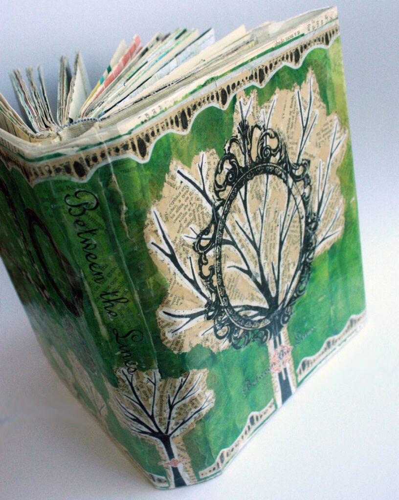
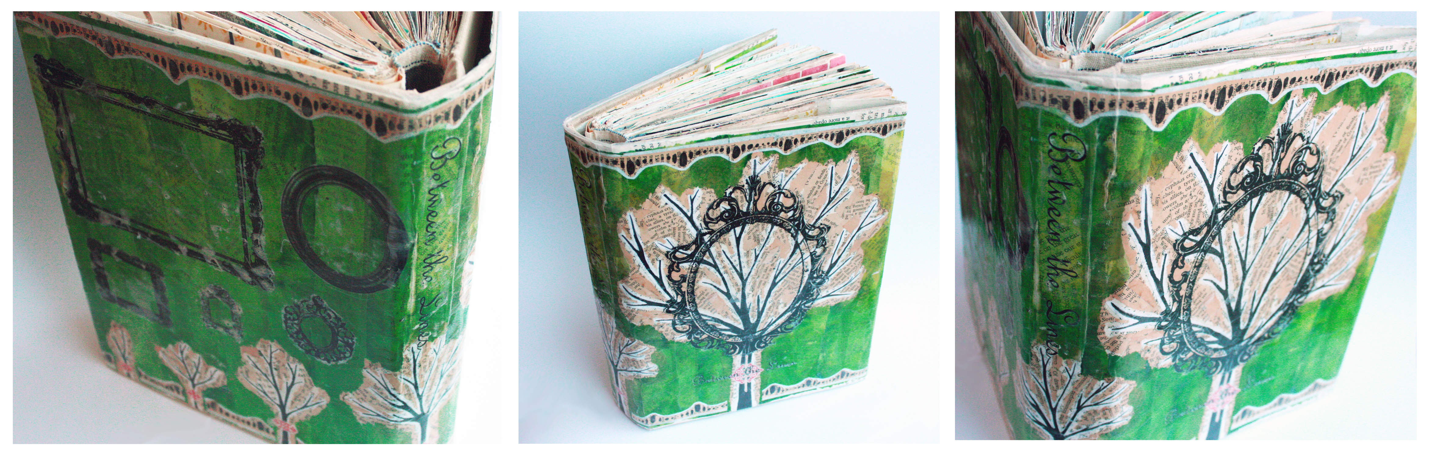
Between the Lines reflects a book of change. I had many plans for the coming year. I had my goals tucked in the back of my mind, and I was determined to record my journey between the pages of this book. To date, this was my favorite book to work in and I am most proud of my creations. I carefully selected this book from the dusty shelves of my local antique store, and fell in love with the decorating tips, vintage styles, and red and black ink that filled the pages.
Typically, when I begin a new book I work on a few pages, decide what the tone will be, then create a cover to align with my plans. However, going into this book I already knew what I wanted it to be. I wanted it to reflect the growth and change I was determined to experience in the next 12 months. I decided the cover needed to come first.
Since I wanted to visually represent an idea of growth, I chose a tree. For a long time I have experienced a slight obsession with the shape of a tree silhouette. Someone once told me if they could choose any object to represent me, they would choose a tree. And it stuck. I admire the long branches, the constant change. Over the years trees grow larger, extending their branches like fingertips. Every season they show change, rebirth, new growth, and a shedding of the old. Trees are interesting and metaphorical in so many ways. Perhaps I also strive to be interesting and metaphorical.
While creating the cover I continuously brainstormed title ideas. Nothing seemed to fit, until one day, while listening to NPR on my daily comment home, a program came on called “Between the Lines.” My ears immediately perked, I liked the ring of it. Everything seems normal, predictable, same old, same old on the surface, but when you look a little closer, you discover something else. This visual journal and title are what inspired me to try something new and different, share my stories and techniques with the world, and finally enter into the ever-popular blogging universe.
SUPPLIES
- Visual journal
- Large, white paper
- Old book pages
- Rubber cement
- Scissors
- Xacto knife
- Bleeding tissue paper
- White tissue paper
- India ink
- Sharpie
- Paint brush
- Red details from the book
- Laser printed images
- Packaging tape
- Laminator
HOW TO
STEP ONE:
I took a large, white sheet of drawing paper, and wrapped it around the book. I trimmed off the edges, leaving the flaps to hold the cover onto my journal. I then ripped up discolored book pages from antique books and layered them over the white sheet of paper. I trimmed off the extra book pages around the edges, and began on the next layer.
STEP TWO:
Because I loved the way the discolored book pages looked, I knew I didn’t want to completely cover them up with the trees. To allow the text to still show through I decided to paint my tree forms using India ink, on white tissue paper. While I love the end product, the process was excruciating. The tissue paper fought my intent the entire time. As I placed the brush on the paper, it would try to wrinkle up. As I used an Xacto knife to cut out the branches, the tissue paper would rip, and threaten to loose limbs from my trees. Once I had all of my trees cut out, showing the transition from sapling to full grown, I glued them down in order, going from left to right.
STEP THREE:
Next, I added color to the background. I stacked yellow and green bleeding tissue paper and dripped water on top. I wanted a light tie dye effect, and using analogous colors allowed me to get the results I wanted. I let the paper dry, then cut it into strips. I began gluing the strips to the background, but carefully ripped the green tissue paper around the tree shapes. I wanted to still be able to see the book pages in the background and the shape of the trees. In the end, it almost looked like the book pages were the canopy of the trees.
STEP FOUR:
After the background was complete I began on the border. I painted a circular pattern on old book pages, cut them out, then layered them on white tissue paper. I cut them out again, leaving a thin white border around the design, then glued it to the edge of the book.
STEP FIVE:
I felt the background still looked a little empty after adding all of my planned elements, and I began brainstorming things I could add. In the end, I decided the perfect addition would be tape transfer frames (read how to do a tape transfer here). The empty frames helped reinforce my idea of growth, change, and trying to accomplish future goals. I chose a range of shapes and sizes, and added them to the back of the cover. I chose a decorative oval frame to add to the front, overlapping the largest tree, to bring even more focus to it.
STEP SIX:
Once I was satisfied with the overall design I began adding the details. I cut out red ink designs from inside the book, and added them to the trunks of the trees. I did a tape transfer of my book title, Between the Lines, on top of the red detail on the front of the cover. Last but not least, I added a framed seed just beginning to sprout to the front, inside flap.
After my cover was complete I had it laminated and covered my book with it. It was no longer an antique, interior design book, it was now my book. For the next year every page would slowly be transformed to something new, different, and so very personal. Interested in teaching visual journals to your students? Check out my visual journal lesson plan here and bundle pack here. Check out my lesson on making a visual journal book cover here.
Thanks for taking the time to check out my blog. Help me spread the word my sharing with others, liking, tweeting, and subscribing. I couldn’t do it without you. Thanks for stopping by!
Related Posts


Leave a Reply