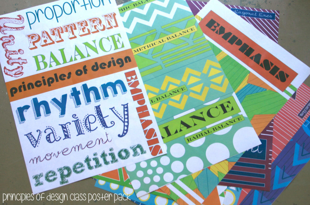
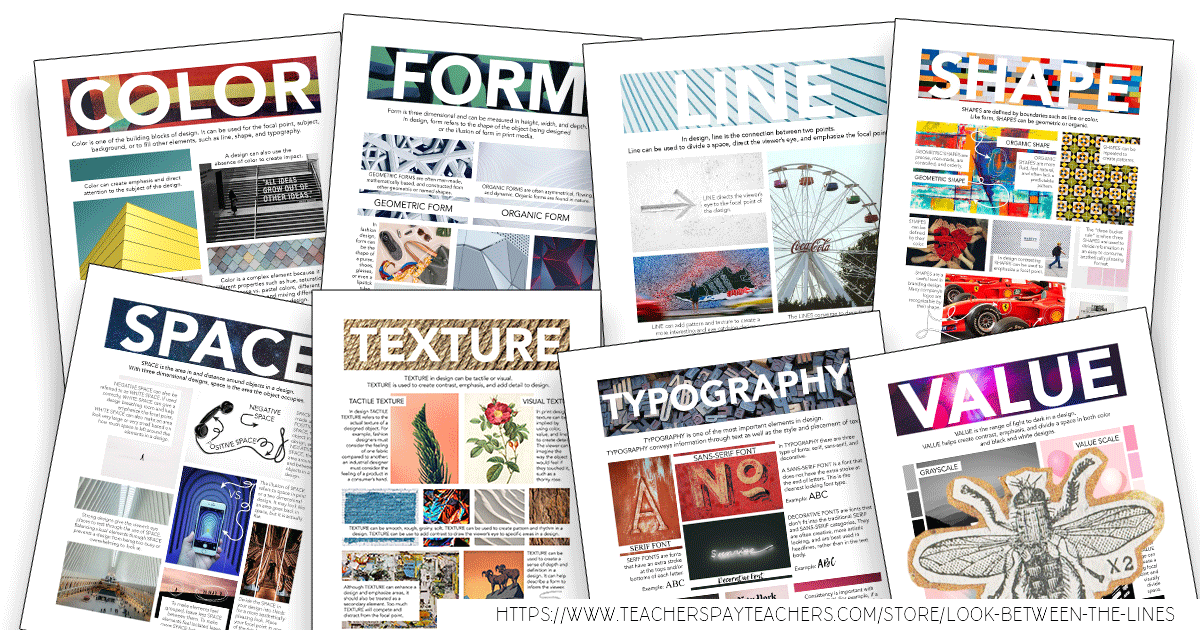
After creating my set of Elements of Art posters, I was addicted. I loved laying them out, creating the patterns, and playing with fonts. As soon as I wrapped up one project, I started on another, my Principles of Design posters. I felt like it would be even more of a challenge to visually represent terms such as movement and rhythm, especially compared to the simpler line, shape, and color posters I had just completed. As I finished each one I proudly added them to my Teachers Pay Teachers shop. I’m excited that I have already sold a few copies, and I hope my momentum continues!
PRINCIPLES OF DESIGN POSTERS
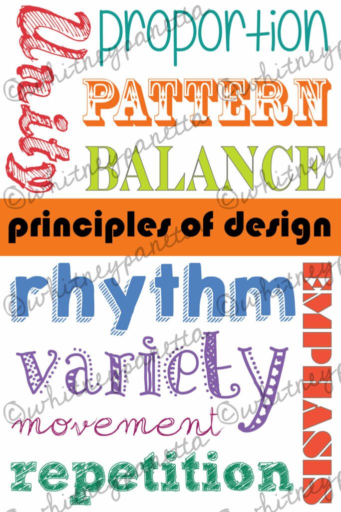
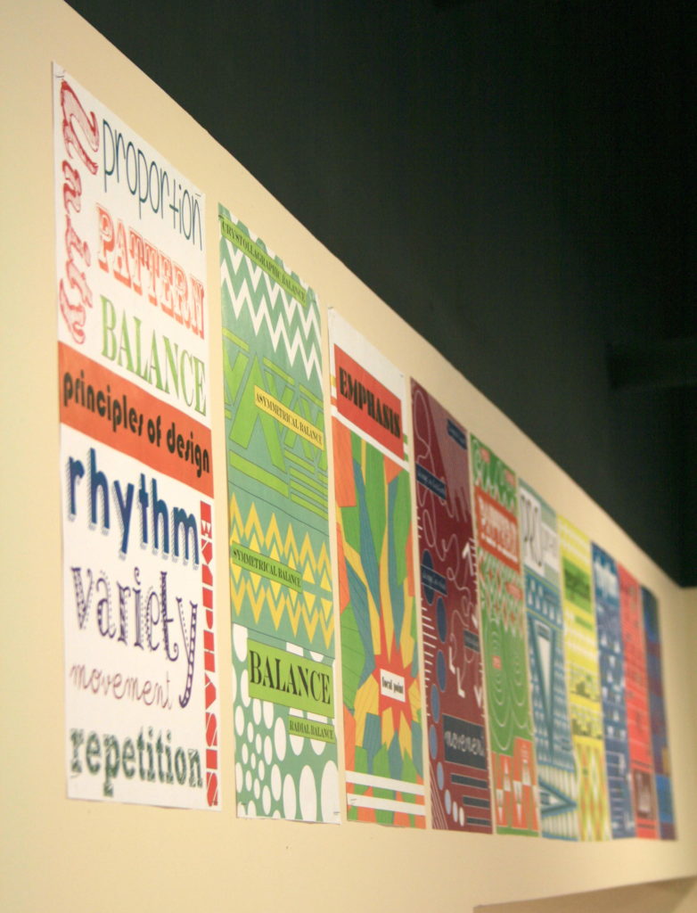
My general principles of design poster visually represents each principle using different colors and fonts. The principles unity, proportion, pattern, balance, rhythm, variety, movement, repetition, and emphasis, are included. I love how this poster mirrors my elements of art poster.
BALANCE
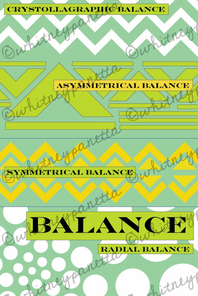
The first poster I completed was the balance poster. I showed different types of balance in the poster, including radial, crystallographic, asymmetrical, and symmetrical. Like my elements of art posters, I was drawn to triangular shapes to create patterns. In an attempt to include a little variety in this poster, I used circular shapes to show radial balance.
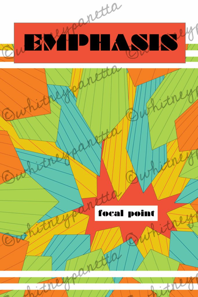
EMPHASIS
Next, I tackled the emphasis poster. I started with triangle shapes once again but ended up converting them into tie-like forms. I copied, pasted, resized, and recolored the shapes to create more interest in the poster. I knew from the start I wanted the points of the “ties” to point to one area and emphasize the focal point. I was very happy with the end result.
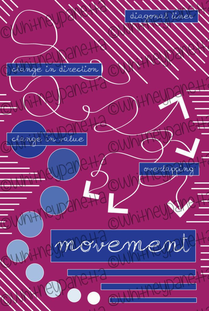
MOVEMENT
The movement poster was the most challenging of all the posters I created. I had an idea of how to show movement, but I struggled to get it on paper. I ended up showing different techniques to show movement such as diagonal lines, changes in direction, changes in value, and overlapping. Using these techniques I was able to capture a sense of movement, however, I am still not 100% satisfied with the end result.
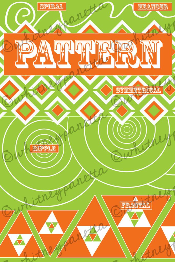
PATTERN
After working on the movement poster for an extended period of time, I was excited to move onto pattern. I already had an idea of reusing my triangle shapes to create a variety of patterns. To balance the triangles I also used circles and a spiral. This poster shows spiral, meander, symmetrical, fractal, and ripple patterns.
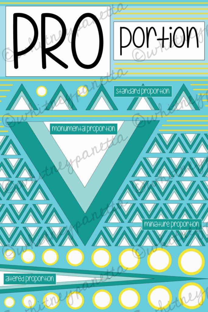
PROPORTION
Proportion came next, and was just as fun as a pattern. I started with a triangle pattern and repeated it through the poster. By simply copying, pasting, rotating, and stretching this shape I was able to represent different methods of using proportion. Standard, monumental, miniature, and altered proportions are shown.
REPETITION
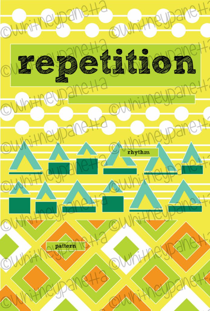
The next poster I tackled was repetition. I used repeating circles on a line to decorate the top, and triangles and rectangles at the bottom. Rhythm and pattern are used to represent the concept of repetition.
RHYTHM
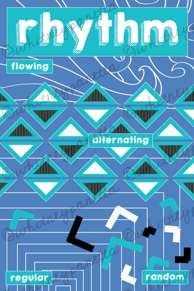
After showing the use of rhythm to create pattern in the previous poster, I was ready to take it on as it’s own concept. I mixed organic and geometric shapes to create a sense of rhythm in my poster. I represented flowing, random, regular, and alternating rhythm through the various shapes and lines.
UNITY
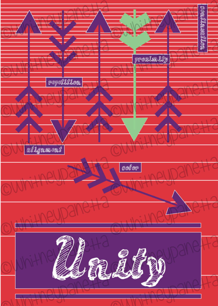
By the time the unity poster came along, I was ready to create a nice simple, unified design. I use a solid red background and layered purple and green arrow shapes on top. The arrows are arranged in a way that creates a sense of unity through the use of continuation, proximity, color, repetition and alignment. I was very happy with the bright, but clean feel this poster has.
VARIETY
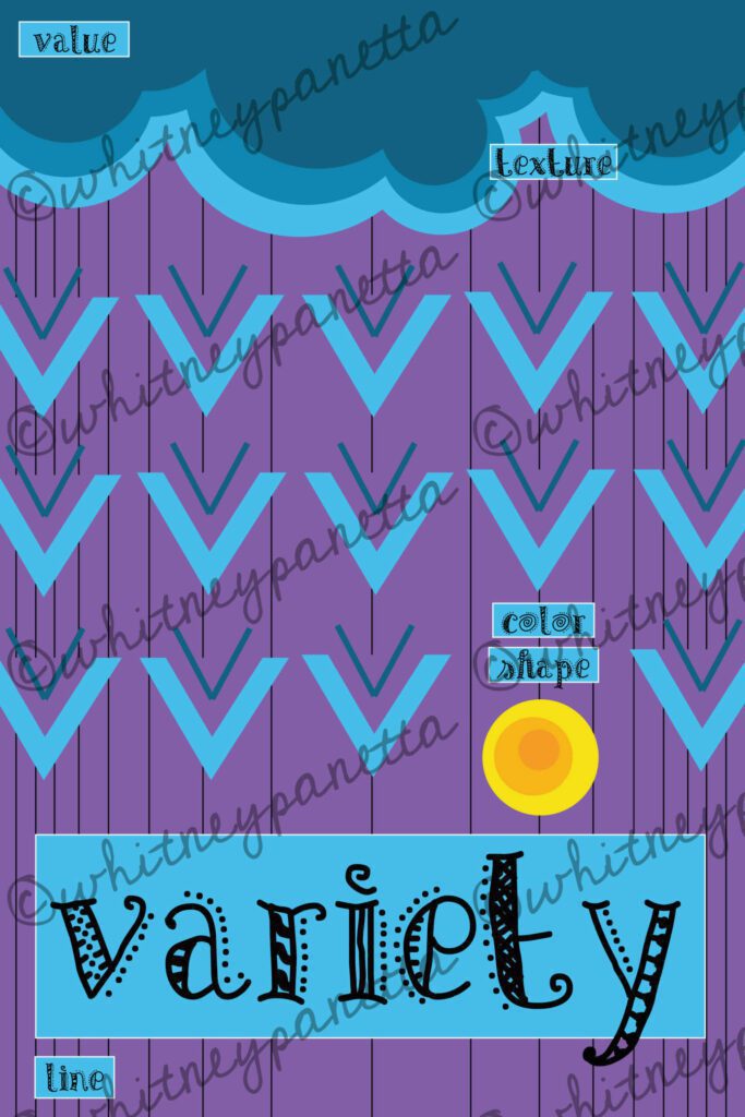
Last out not least came variety. It was a struggle at first to create a poster that represented variety, without looking cluttered. I was very happy with the rain-like scene I created, and the variety of shapes and colors I used. The concept of using color, shape, texture, line, and value to create variety are shown through the poster.
Thanks for taking the time to check out my blog and my newest Teachers Pay Teachers addition. Check out my TPT shop here. Help me spread the word about my blog by sharing with others. I couldn’t do it without you. Check out more blog posts here. Don’t forget to follow me on Instagram and TikTok for weekly visual journal demos. Until next time!


I love your posters. This would be a good computer project for my advanced 8th grade art students.Thank you!
I never thought of it as a project idea, but I love it! What a great way to reinforce the elements and principles too. Let me know how it turns out!
hi this information is a very valid,for students,upcoming artists to grow more professionally.