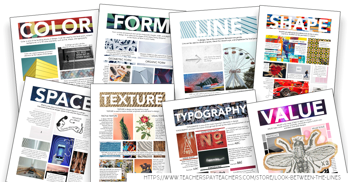
As an art educator, the elements of art and principles of design are something that is naturally incorporated into almost every lesson. An elements of art poster set is an important part of an art classroom. They are the basics of strong, interesting, and successful works of art. From the moment kindergarteners step into their first art class until an art major in college leaves their final studio course, the elements and principles should be an underlying theme.
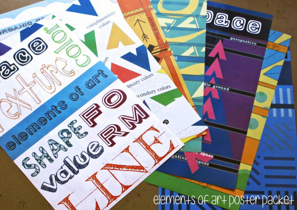
As I sat around enjoying my time over the summer, my mind continuously drifted to thoughts of the upcoming year. I had a goal, to add some decor to my classroom, to help make it my own space and brighten it. After some brainstorming, I decided what better way than to make my own poster set. I got to work and created a poster to represent all elements of art and principles of design. Not only was it a great addition to my classroom, but it was also a nice addition to my Teachers Pay Teachers store (which I am now addicted to).
GENERAL ELEMENTS OF ART
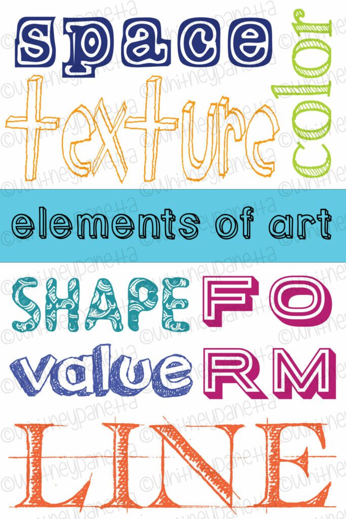
Although this was the very last poster I made, it is the poster I like to start off with. It showcases all the elements of art, including line, shape, value, form, texture, space, and color. I waited to the very end to make this poster because first I wanted to determine which fonts would represent each element. Using Adobe Illustrator I added a rectangular, filled box in the middle, then laid out my text around it. There was a lot of adjusting and re-configuring as I tried to fit the lettering in just right.
COLOR
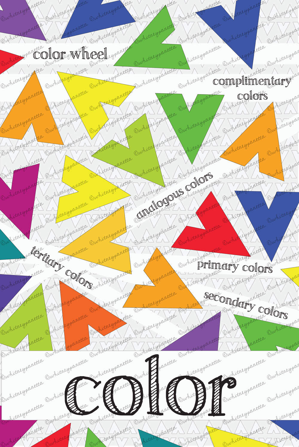
The color poster was my first creation, and I am very happy with the way it turned out. I love the current triangle trend, and decided it was a great shape to use in my posters. Using the line tool in Illustrator I constructed my arrowhead, triangle shape, repeated, resized, and recolored to to represent the various color groups. Primary, secondary, tertiary, analagous, and complimentary color examples are included.
SHAPE
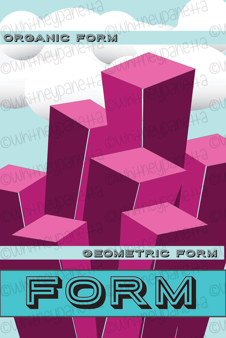
I was excited to work on the form poster, because it was a challenge to create the illusion of a three-dimensional form on a two-dimensional space. Once again I used the line tool to construct my block shapes, then filled them with color. I had fun using the circle and oval tool to create clouds in the background. Examples of organic and geometric form are shown in this poster.
LINE
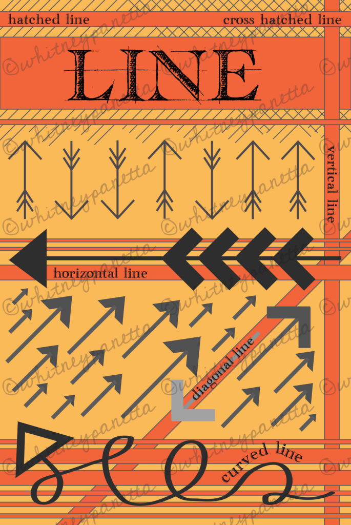
Because I enjoy triangle and arrow shapes, I was very inspired by the idea of line. I used different variations of these shapes to represent horizontal, vertical, diagonal, and curved lines. I used straight lines behind the title to shape hatched and cross-hatched lines, which added an interesting texture. I love the way the colors look on this poster. It is a nice contrast to the first two I completed.
SHAPE
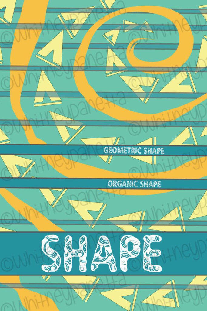
At first, I was stumped by what to do for the shape poster. I decided to continue the triangle theme, to show geometric shape, but I was unsure what I could do for organic shape. After playing around with a few ideas I decided to use the brush tool in Illustrator and create a spiral shape. The geometric shapes fit nicely between the sections of spiral, which in turn made a very cohesive design.
SPACE
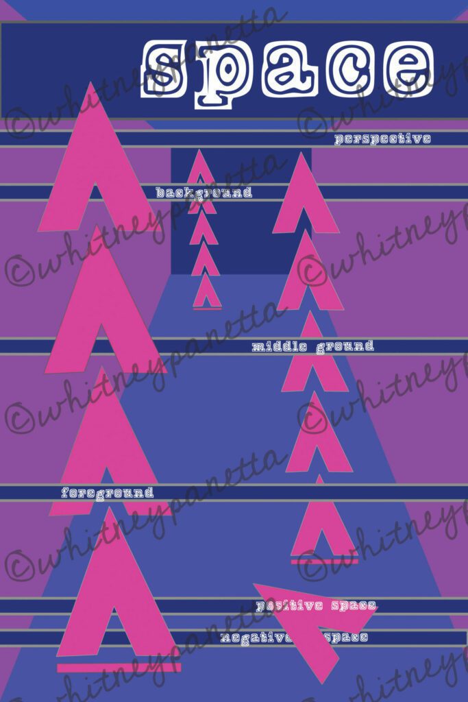
Space was another difficult concept to put on paper. I knew I needed to show perspective, in order to create a sense of space, so I began adding diagonal lines and playing with shades of colors. After I create the hallway-looking area I decided to add more triangles to show the foreground, middle, and background. I was able to create a send of space by making the shapes smaller as they moved back. In the foreground, I also include an example of positive and negative space.
TEXTURE
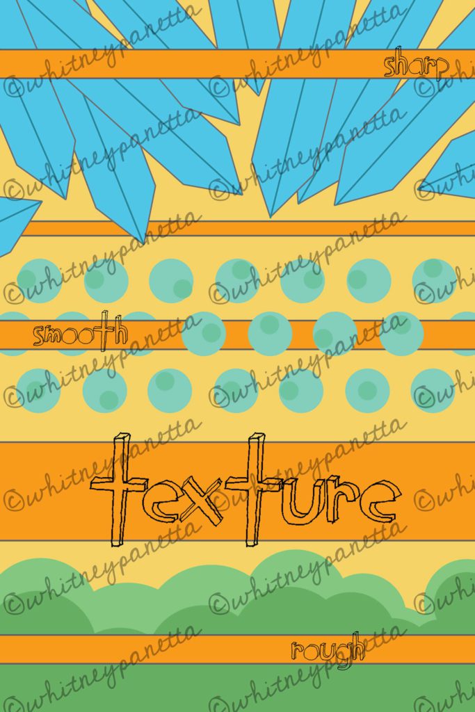
I had a lot of fun making the texture worksheet. I loved playing around with the various shapes in illustrator, creating my own Mario-esque world. I used dagger shapes to represent sharp, circles for smooth, and overlapping circles for rough. The bright colors are fun and youthful. The pop of yellow works nicely with the other posters.
VALUE
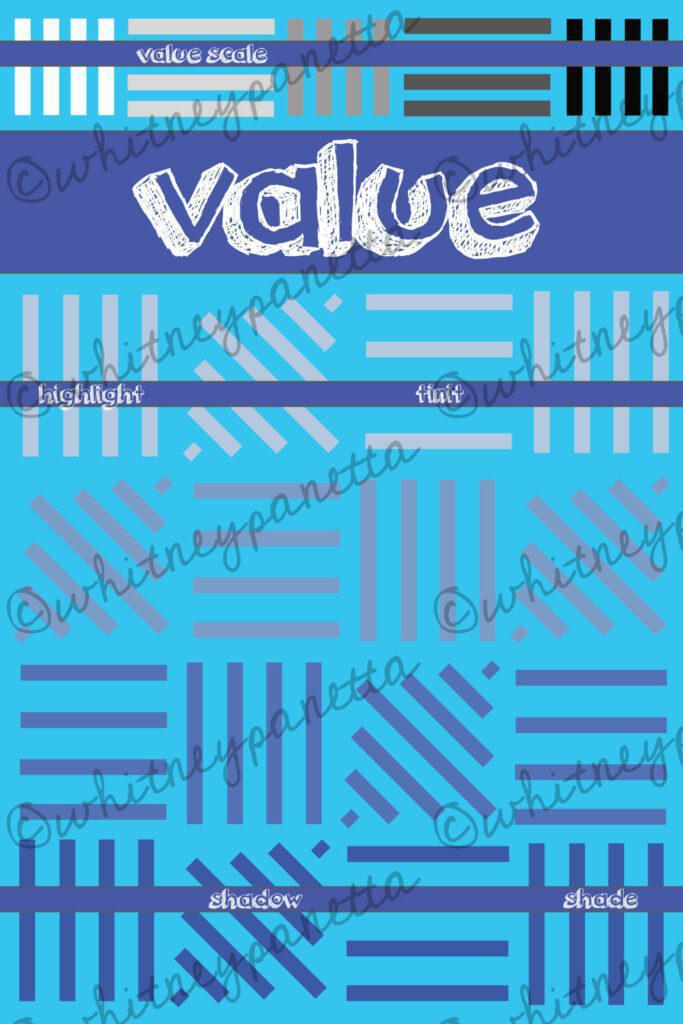
Finally, I was on my last element of art. It was time to visually represent value. Since I used triangles in so many of the other posters, I decided to do something different. I created block shapes using thick lines, and varied the color from light to dark with each block. Value scale, highlight, tint, shadow, and shade are represented in this poster.
ON DISPLAY
I hope other teachers find this resource useful in my Teachers Pay Teachers shop (check it out here!). I have already printed out a set to hang in my classroom, and I love how they look.
Thanks for taking the time to check out my elements of art posters! I hope they help inspire new ideas for your classroom. Help me spread the word about this post and my blog by sharing with others on your social networking site of choice. Check out more blog posts here. You can shop my education resources on my TPT or on my blog. Don’t forget to follow me on Instagram and TikTok for weekly visual journal demos. Until next time!



I was curious if there was a canadian version of the Colour Sheet and if there was the additional form sheet? Thanks
I actually did create a revised colour version. I believe I sent it directly to the buyer after the set was purchased, I need to go ahead and add it to the pack. What is the additional form one? I’m not sure I’m familiar with it.