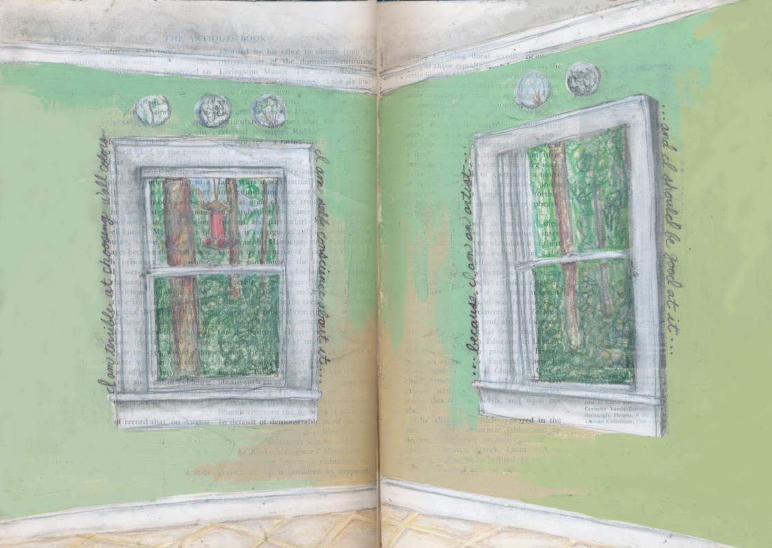
I’m a little embarrassed to admit it, after all, I am an artist, but I am terrible at picking wall colors.
I love going to the paint aisle of hardware stores. It’s all metal, wood, industrial until you hit the paint section. Suddenly bright colors, nice aesthetics, and a more feminine side of a typically masculine place appear. I always have a very specific color in mind when shopping for my home projects.
For the kitchen I wanted green, but not just any green, a nice bright, bold green. I walked over to the green paint samples, and one immediately caught my eye. It was bright, bold, a beautiful grass green. I tried looking for other colors, various shades, and anything else that struck me like this green. But, I was too distracted by my initial gut feeling. This had to be it, this had to be the perfect color.
Another issue I have is my impatience. I want things and I want them now. I want to start a project, and it needs to be done ASAP. When you combine this with an inability to choose wall paint, you end up with a money deficiency and an excess of paint. This day was no different. I decided since I had such a gut feeling about this green, I should go ahead and buy it. That way I could head straight home, get to painting, finish this project, and still have a relaxing Sunday to look forward to.
I headed home, got out my brushes and drop cloth, and got to work. The first brushstroke I felt good. I kept visualizing my bold kitchen. I played entire conversations in my head about guests coming over, complimenting our kitchen, and wishing they were as bold as I was because it looked so good. Suddenly my kitchen was gracing the covers of home improvement magazines, Better Homes and Gardens, Good Housekeeping, Southern Living, they all wanted a piece of my beautiful, grass-green kitchen.
By the time my daydreams had worked their way through my brain, the wall around one of my kitchen windows was complete. I stepped back to admire my work, and the flutter of excitement gave way to the “uh oh… I think I made a mistake.” All I could think was lego. It was bold alright, it look plastic, childish, and so very green. I refused to give up on my color and waited until Nick came home and hoped he would see something different than I did. He was shaking his head before he even made it into the kitchen.
This green was not going to last. I was once again off to the hardware store, with a little less pep in my step, and a little less confidence in my color taste. I went back three more times trying to find my perfect green. Every time a new shade went on the wall my confidence took another hit. I couldn’t get it right. My one-day project suddenly stretched a week. Our neutral and slightly boring kitchen had transformed into a disaster. Four different shades of green splattered the walls, not one of them looked good.
When I look at a paint tester I see a small section of color. I fall in love with the bright shades. What I can’t get past is visualizing that small 1″x1″ square as an entire room. Once you have a wall painted the color transforms. Bright and beautiful turns overwhelming.
Finally, Nick had to step in. Together we went to the paint store. He walked right up to the greens I had visited so many times and grabbed a color. “Recycled Glass”, a lovely, light shade of green. I wasn’t convinced, but after four attempts of my own, it was Nick’s turn to give it a go. We bought our gallon, went home, and I once again started to paint.
I hated to admit it, but it was perfect. The light shade on a large scale was bright, and bold, but not too bold. It was the green I was searching for. I still have not regained confidence in my wall color-selecting ability. Another disaster trying to paint my front door blue certainly didn’t help. For the foreseeable future, Nick will have to be by my side, giving his two cents when it comes to paint colors.
SUPPLIES
- Visual journal
- Rubber cement
- Pencil
- Colored pencils
- Wall paint
- Sharpie
HOW TO
To create this visual journal page I decided to recreate my kitchen in my book. I knew I wanted to use the actual failed wall paints, so I opted to tear two pages from my book, paint them, then glue them back in. This prevents wet materials, like paint, from seeping through multiple pages.
After ripping out my two pages I draw out the corner of my kitchen using pencil. I wanted the outdoor area to stand out through the window, so I decided to color it in using colored pencils. For the interior space I used watered-down white paint for the molding and lightly colored with colored pencils for the floor. I then opened up my many cans of wall paint and added a touch of each green to my drawn walls.
Once they dried I added words with sharpie and glued them back into my book using rubber cement.
I am terrible at choosing wall colors… and I am self-conscious about it… because I’m an artist… and I should be good at it.
CHALLENGE
Create a visual journal page about something you wish you were good at.
Thanks for taking the time to check out my blog! Help spread the word by sharing with others, I couldn’t do it without you. Thanks for stopping by!


0 Comments