Abstract art is one of my favorite types of art and it’s an art form that I always include in my high school visual art curriculum. It can be hit and miss, some years they get it and run with it, other years it’s like pulling teeth. Despite my mixed results I am committed to always including painting abstract art in my lessons because it can be under-appreciated by those who don’t understand it. AKA, please don’t tell me “I could’ve done that.” Because guess what, you didn’t.
Abstract works of art may look simple, but it is in fact one of the most complex forms of art and reflects a much higher level of thinking (yes, there is a lot of thinking that goes on in art making). Because of this fact I was very wary of doing an abstract art project with my advanced class this year. They are a wonderful group of kids, but overall their technical ability and creativity level is lower than what I typically have in my advanced classes. My tried and true projects were very hit and miss this year, and I felt like a failure of a teacher. I just couldn’t figure out my “in” with them.
So of course, knowing all of this information I decided to develop a new painting abstract art project that was bigger than ever and more open ended than over. I was convinced it was going to fail miserably, but I continued down the path anyway.
I attribute the formation of this painting abstract art project to watching cartoons with my two year old. We were deep into watching Inside Out for the 1000th time when the abstract thought scene came up. If you have never seen it, Google it, it’s an amazing explanation. The characters show the progression of abstract thought through verbal and visual explanations. The characters literally abstract before your eyes. The light bulb turned on.
I put together a PowerPoint including a link to the clip (plus a few other video clips) and three abstract painters to show examples of the three main elements in abstract artwork. These famous abstract artists are: Piet Mondrian for line, Wassily Kandinksy for shape, and Mark Rothko for color. The only guidelines I gave my students were it must emphasize either line, shape, or color (all three will be included, but one will be showcased) as well as balance, unity, and a focal point. The three elements are the building blocks and the three principles are what make it a successful work of art.
I was so worried. Typically with my painting abstract art projects I have my students start with a concrete base, such as a photograph of a landscape or an object, and I help them simplify and abstract it before they start painting it. But this project took it to a new level, it was high level problem solving. I set them off to work and as always with a new project I worked on my example along with them.
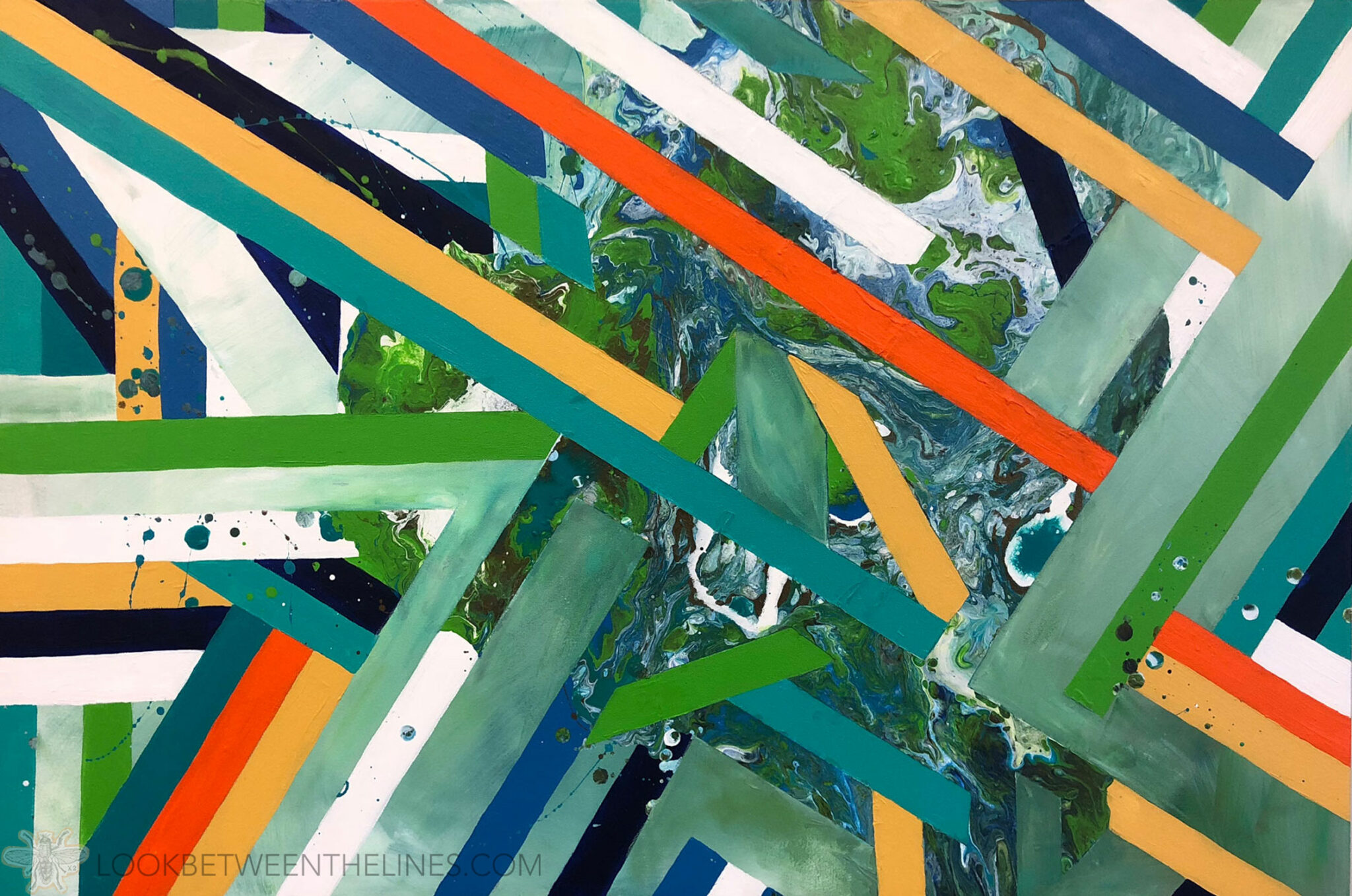
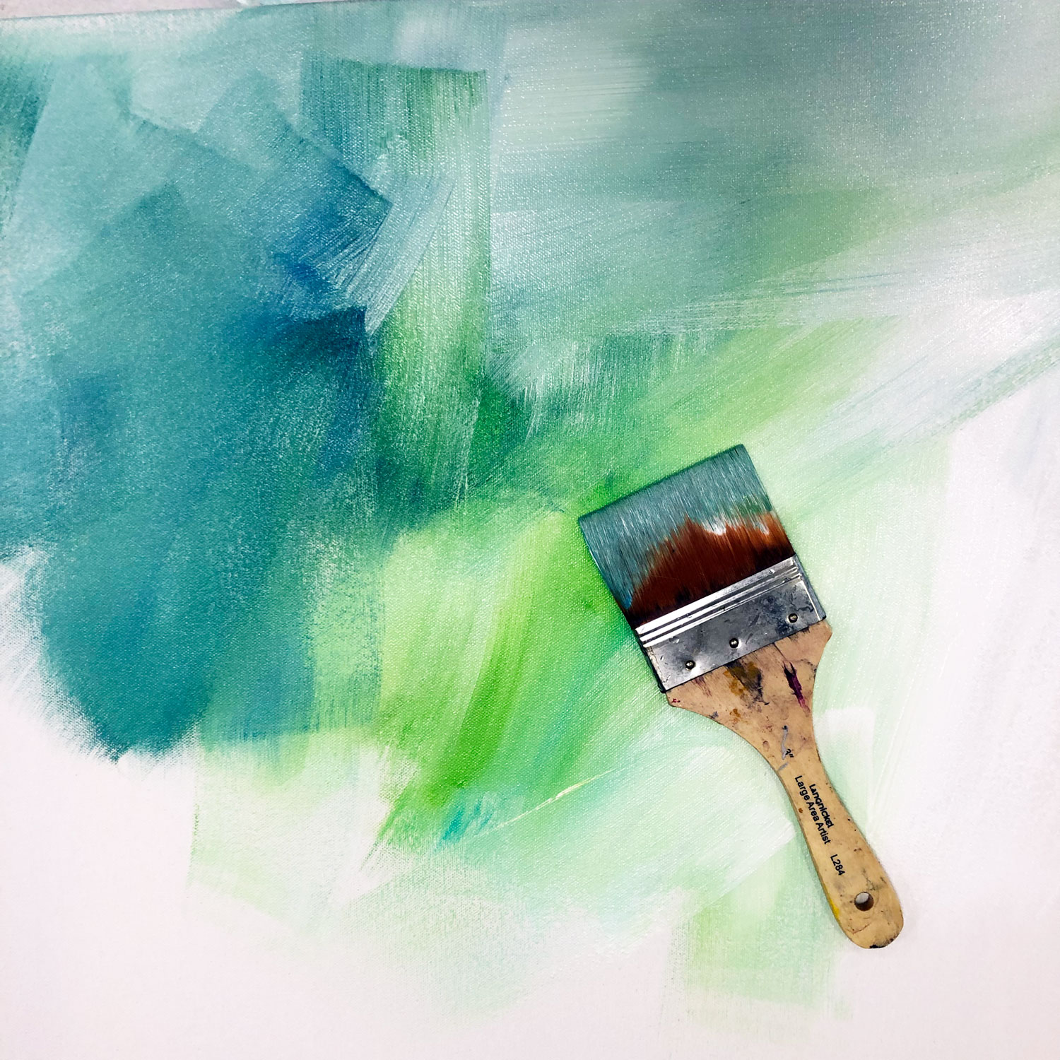
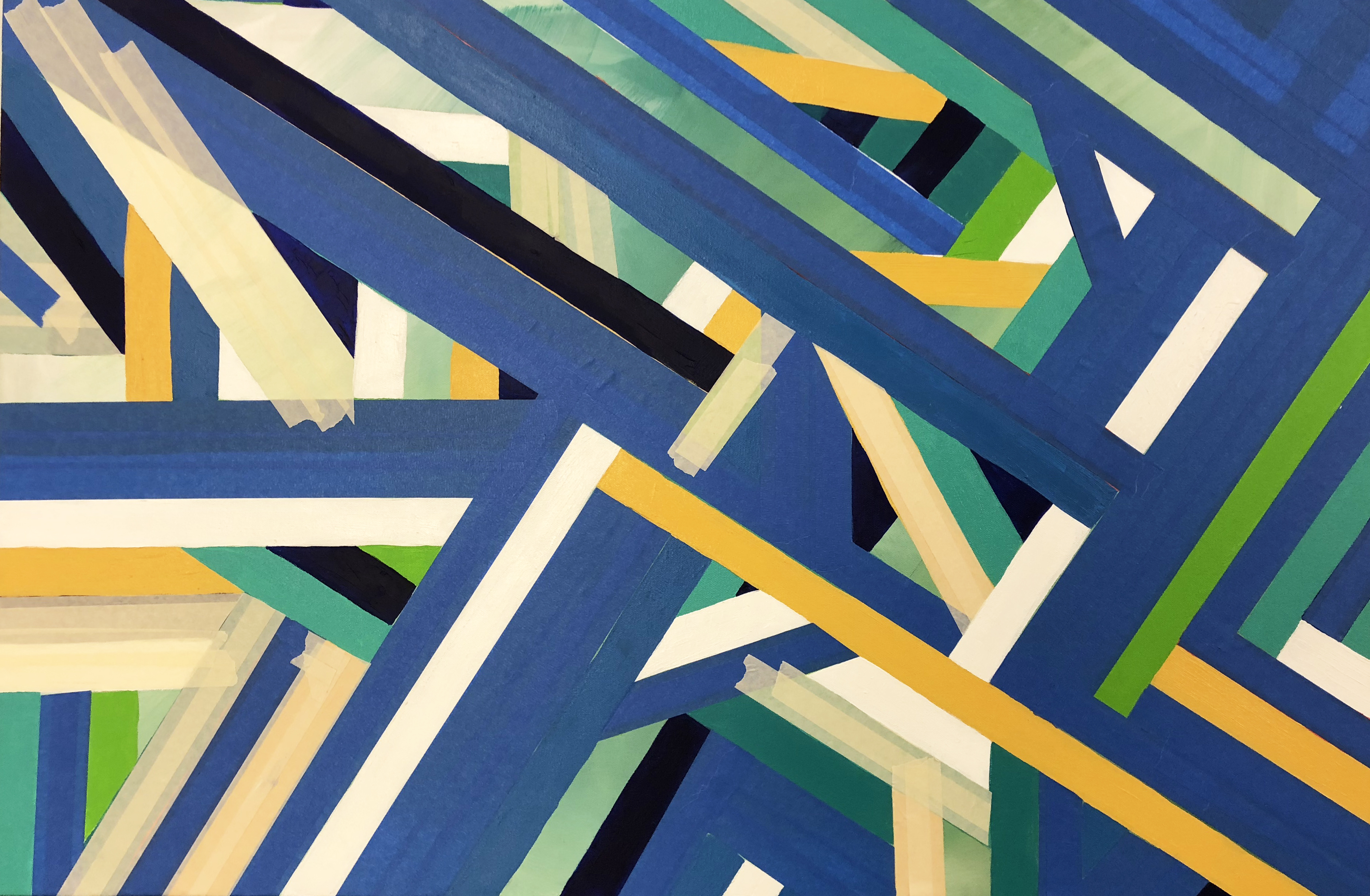
Each student got a 36″x48″ canvas. This was the largest any of them had ever worked. I sent them off to sketch and I began to work on mine. I decided I wanted to focus on cool colors, with pops of warm, incorporate an acrylic pour somehow and emphasize line. In my head I wanted the organic shapes of the acrylic pour pattern juxtaposed with the geometric lines. First I painted the entire canvas using the cool colors I planned to incorporate into the stripes.
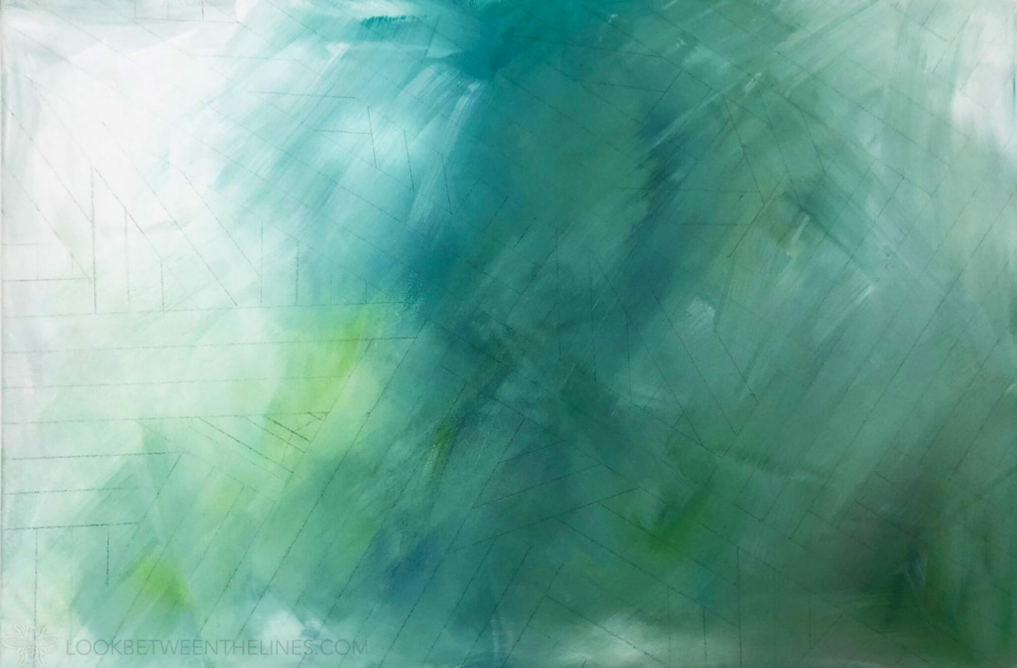
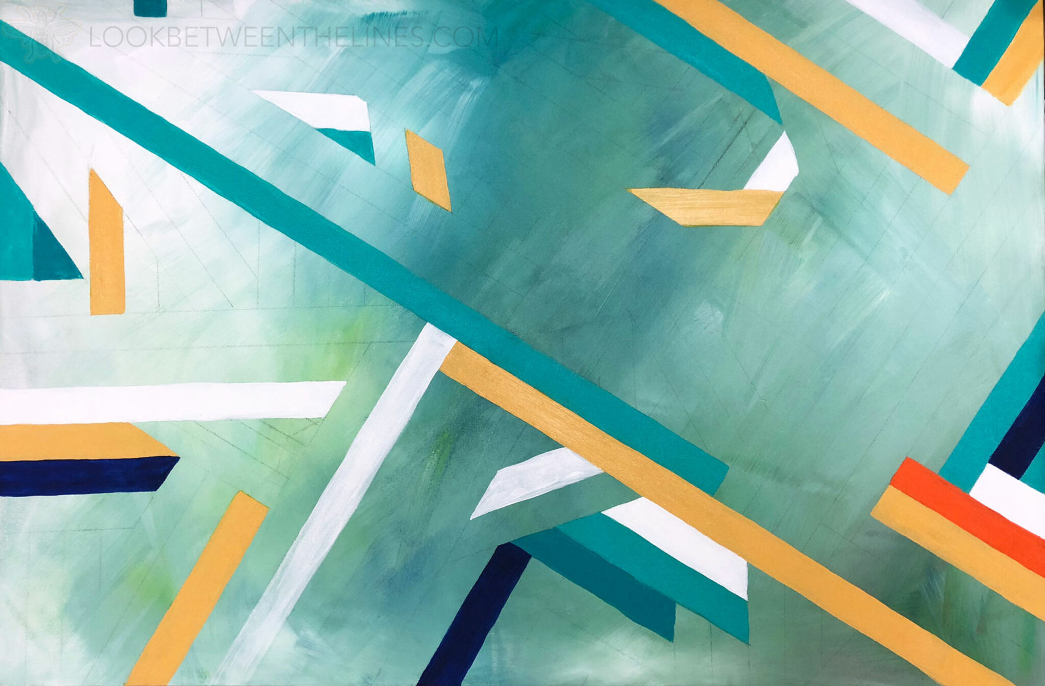
Next, I used a ruler to create a line pattern. I had a loose idea to focus on diagonal lines, but from there I started laying the lines out and made adjustments as I went.
Once I felt confident with my pattern I began filling it in.
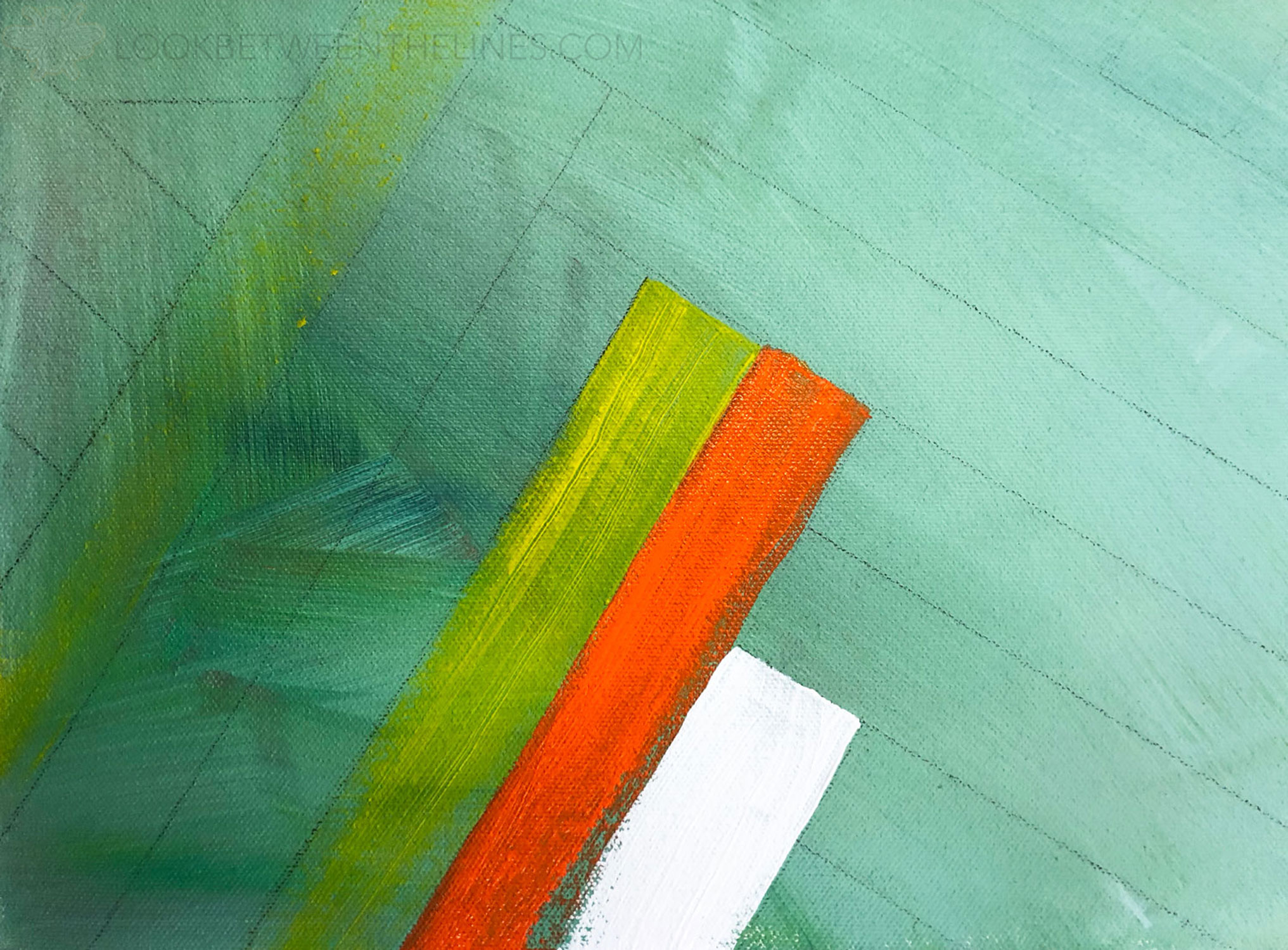
I wanted the bright orange to help create a focal point.
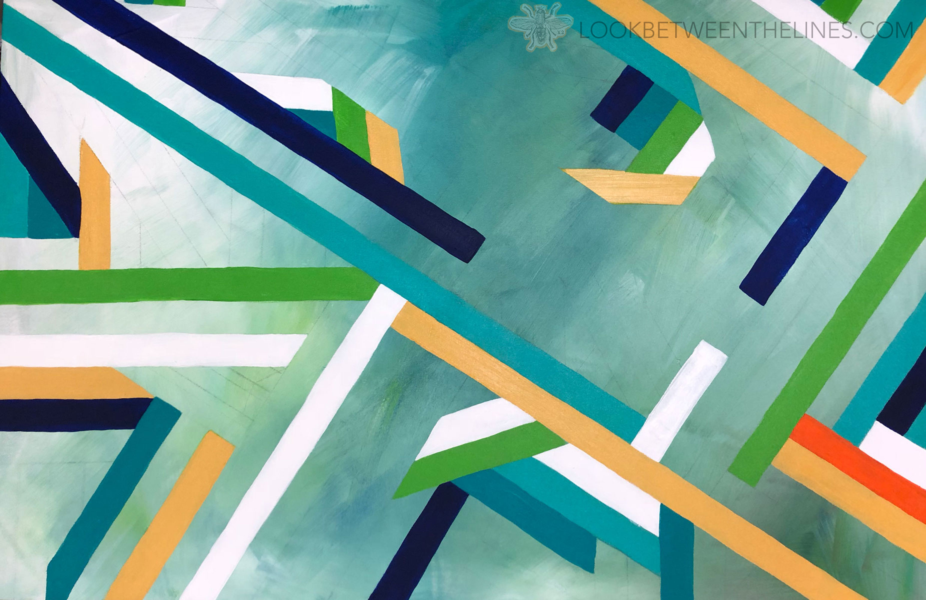
Again, I had a loose idea of the different colors I wanted and would scatter them around the canvas before starting another. I would periodically take a step back to make sure the use of colors looked balanced before adding more.
I wanted the background to make up some of the stripes and as I began filling in the lines I decided I wanted to have more of a variety of shapes, rather than the same width lines covering the entire piece. To create that look I didn’t fill in large chunks of the lines and instead left the background showing through.
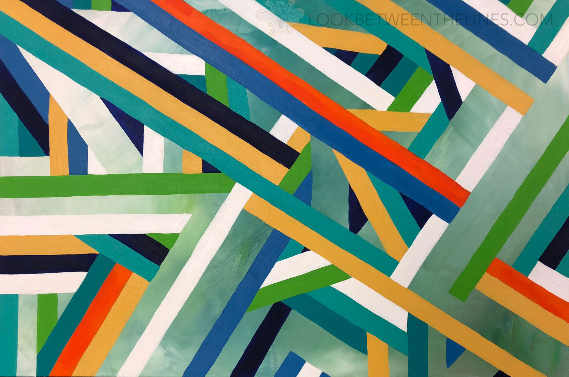
I waited until closer to the end to add more orange stripes to make sure they remained the focal point. At this point I loved the piece. I began questioning whether or not to add the acrylic pour aspect. But, I decided to follow through with my plan. The organic look of the pour would either elevate it, or hurt it, but at least I had photographic evidence of this point in case I hated the final version. Plus, you can always paint over what you don’t like.
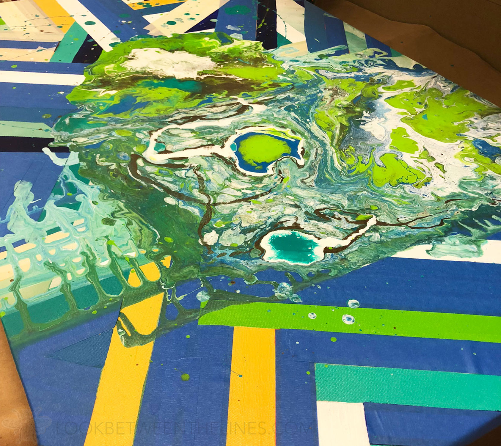
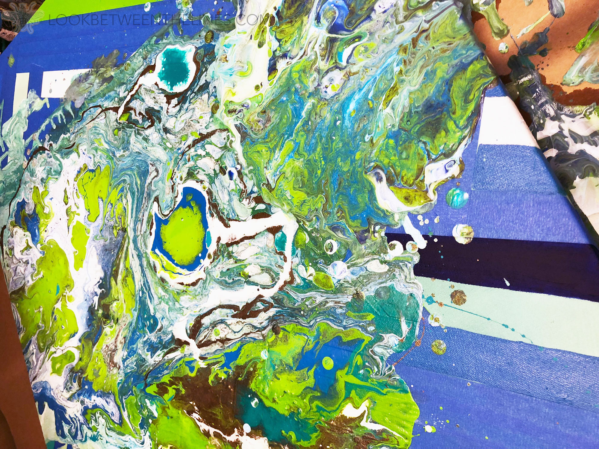
I didn’t want the acrylic pour to look like a paint spill on top of my piece. I wanted it to look intentionally included. To achieve this I decided to let it fill in some of the strips, but have clean strips cutting through it. I carefully taped up specific sections and tried to visualize where the paint would fall.
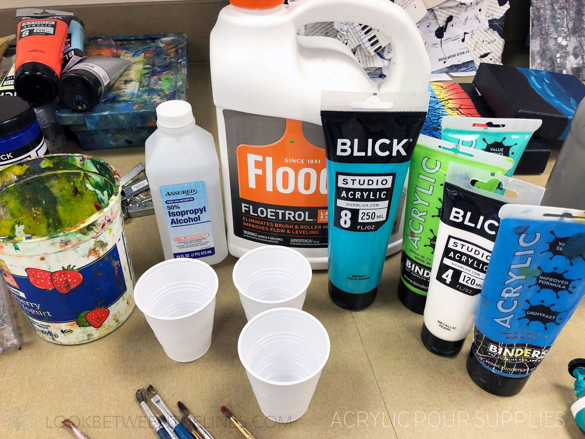
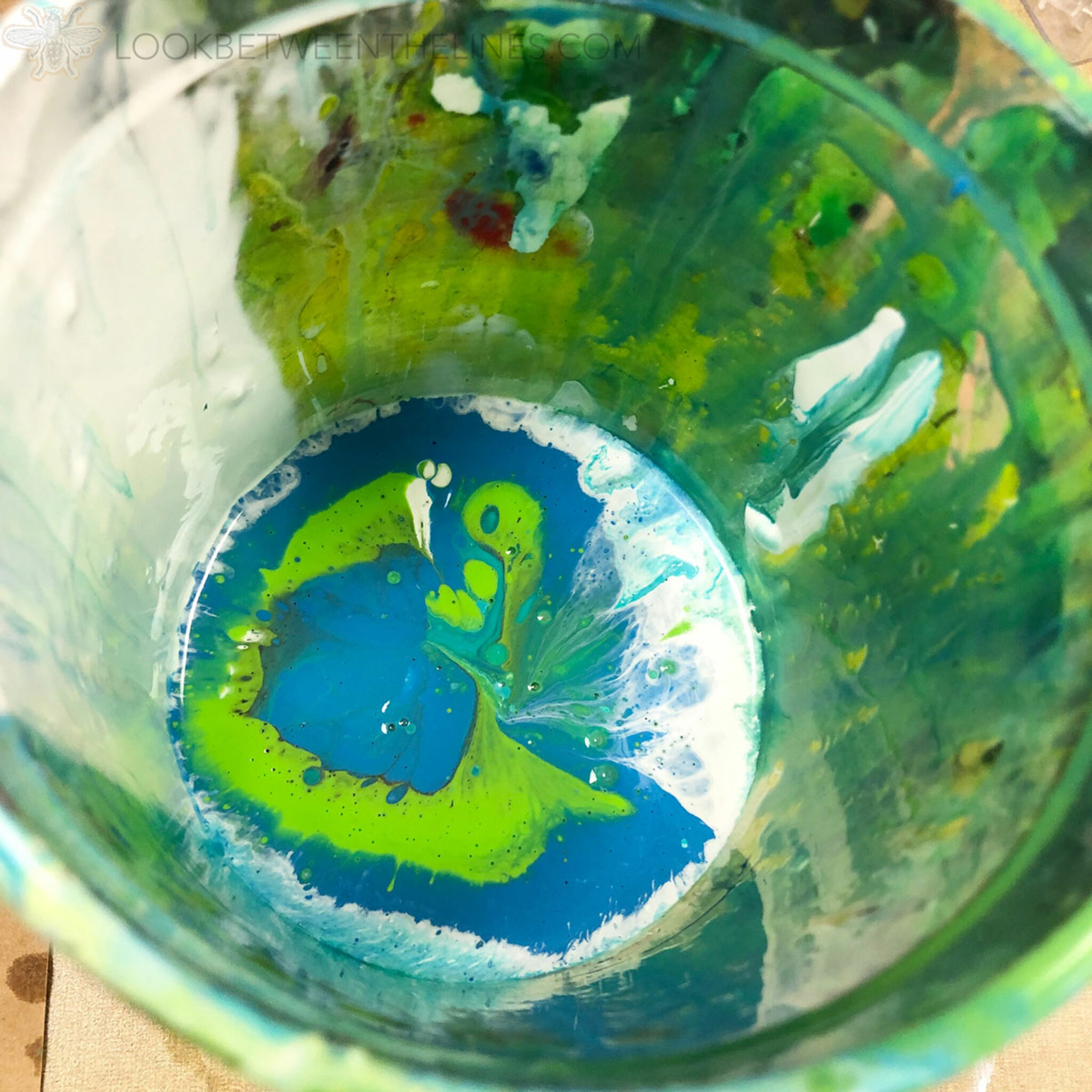
At this point I had never done an acrylic pour before. One of my students was familiar with the process, and she did some on her abstract acrylic painting. I read a few how tos, watched a few videos and carefully watched her technique before trying it on my own (once my class had dismissed just in case it was an epic fail). I put my acrylic paints in individual cups and mixed it with water, floetrol, and tested some rubbing alcohol on a few. I poured the smaller cups into a larger one, alternating the colors.
Full discloser, the first pour was a HUGE failure! I didn’t thin the paint enough and it ended up being a huge glob of paint that would not spread. I quickly wiped all the paint off and had a moment of silence for the wasted supplies. Attempt two went much better. I still sweated a bit as I tried to spread the paint while maintaining the beautiful cells, it’s way harder than it looks.
After layer one I decided I wanted a little more, so I did a final pour on the lower half.
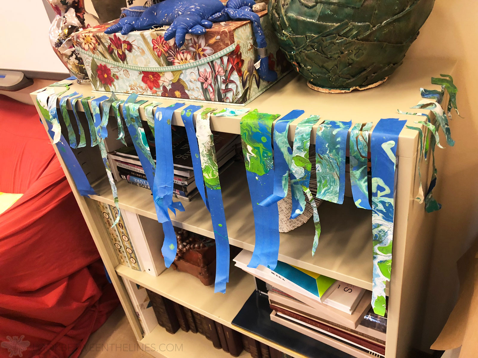
After letting it dry overnight the moment of truth came and I began peeling off the tape. I was slightly disappointed, the paint still seeped under the edges of the tape, which meant a lot of clean up, but I was excited about the potential. After a lot of cleaning up edges I decided I was very pleased with the end result.
And the best part is the tape will make an amazing visual journal page in the near future.
Painting Abstract Art Summary
In case you are wondering, this painting abstract art project ended up being the most successful project of the year. All of my students excelled and these large scale abstract acrylics made beautiful and impressive additions to our annual art show. I don’t know if I can attribute the success to my enthusiasm for it, working along with them, breaking it down into basics, or my Inside Out clip, but whatever it was I will take a win at the end of the school year.
If you are interested in learning more about this painting abstract art project check out my lesson pack here. It is designed for advanced or AP art level high school art students, but I believe the basics can be kept and it be sized down for earlier high school or middle school students.
Thanks for taking the time to check out my blog! Check out more visual journal pages here and more of my TPT products here. Help spread the word by sharing with others. Thanks for stopping by!


0 Comments