
This visual journal page is very sentimental, it captures a piece of our wedding, a piece of the commitment we made to each other. By the time this page was created, I had spent the last five and a half months planning my dream wedding. I had carefully picked out the venue, food, flowers, music, dresses, suits, table settings, and of course, the invitations. Nick and I had spent the last five and a half months talking about little more than our wedding. And I realized that Nick and I almost forgot what all this planning was for. It was for us, to celebrate our commitment to spend the rest of our lives together.
After I came to this epiphany, I realized how little time we had spent together. While we had spent a lot of time planning, discussing, and preparing for the big day, we had not spent quality time together. Once we realized this, for the first time in months, we took a moment and went out on a date. We did not talk about the wedding, we talked about our day to day lives, our lives post wedding, and all the amazing things we were going to do on our honeymoon. It felt like us again, normal, pre-wedding Nick and Whitney.
We were planning our wedding, the day to celebrate our commitment to each other. Through this process I should’ve felt closer than ever to Nick, knowing he would soon be my husband, but it was the opposite. I forgot what we were planning for, and I neglected us. I’m thankful I came to this epiphany before our big day. I’m glad I took a step back, and spent quality, non-wedding time with my future husband.
I knew I wanted to remember that moment. I decided the best way to do that was to make a page that included our invitation. Our invitation was how our big day was perceived from the outside. We were running around like crazy. trying to get everything done, forgetting what we were planning for. But, no one else saw that. They were coming to celebrate our marriage, to show their support, to be there for us on this incredibly important day.
Our invitation was one of the early decisions I made, and it was a decision we made together. I loved the way they looked. They were simple, elegant, and had our wedding colors in them. When the RSVPs began rolling in, I knew it was happening. We were on our way, we were almost finished, we were almost to the moment we had been planning for. The planning was winding down and the celebrating would soon begin. I was about to become Mrs. Panetta.
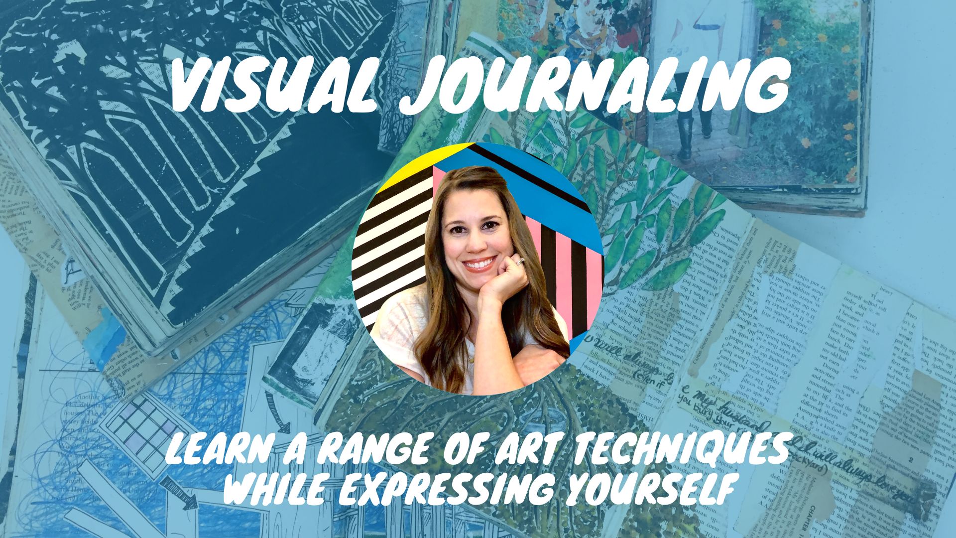
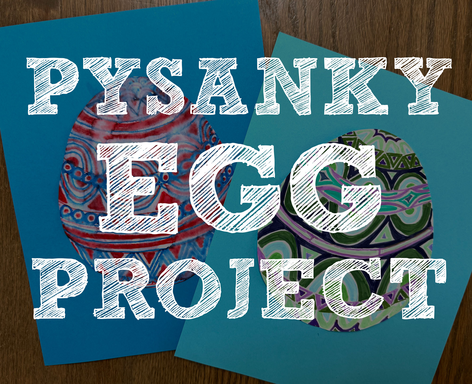
CHALLENGE: Create a page about a commitment. It could be a wedding vow, new job, diet, divorce, house, or even a commitment as simple as trying to make your bed everyday.
To make this visual journal page I incorporate our wedding invitation, envelope, RSVP card, one of our engagement pictures, construction paper, and book pages. I wanted the page to have a vintage feel to it, so I wanted the base to have a brownish tint to the paper. I found an old book, with stained pages, and glued them down to the background. I knew I wanted the invitation to be placed in the center, and I wanted it to stretch between both pages. I carefully placed them, but decided the page needed more. Since our colors were blue and brown, and there was a lot of brown in the invitation, I decided to incorporate blue construction paper.
I used three different blue pieces of construction paper, and ripped them up into small pieces. I placed them along one edge of the invitation and the RSVP card. I liked how it looked when I had the colors arranged going from lightest color blue to darkest, and when I put a light color book page right along the edge of the invitation, it all came together,
Since Nick and I were planning this big day for us, and since I had almost forgotten that already, I knew I wanted to include a picture of us in the page. I chose a black and white photograph from our engagement session, I thought it went well with the vintage style I was trying to achieve. To help it blend in, and not overpower the invitation, I did a tape transfer. I played around with various spots on the page, and realized I was going to have to cut the image down since the invitation took up the majority of the space. Rather than cut it into a smaller rectangle, I decided to cut along the lines of the rock wall behind us. I took the extra pieces of the rock wall and placed them around the page to balance out the black and white image.
It took me a number of tries to get the tape transfer placed just right. I ended up having to go back, and cover up the words in the area our faces were going to be. I decided to do this because the image was transparent, and the words in the background overpowered the details in our faces. If something isn’t working just right don’t be afraid to make changes.
I hope you enjoyed today’s post! If you did, help me spread the word by e-mailing, linking, tweeting, subscribing, and please feel free to comment! Thanks for stopping by.
[subscribe2]
Related Posts

Leave a Reply